
If the walls of a room are an outfit, think of the trim (also known as woodwork, window casings and the like) as a statement accessory. With that in mind, many designers are turning to rich tones that imbue a room with charm.
“I love choosing trims that are timeless colors that last generations,” says Elizabeth Cross-Beard, of Palm Henri in Baltimore, who often favors a high-gloss finish.
And no, white is not necessarily the right move. “I think that you can actually add a lot of character to your room by picking not a white,” says Joy Williams, a designer in Chicago.
“Trim is meant to ground a space,” says Cross-Beard, who recently chose an “almost a merlot eggplant” for a wallpapered mudroom she designed. It’s unexpected, which jibes with her overarching advice when it comes to selecting trim: Pick a lane, whether it’s bold and brash or a safe, easy-to-live-with shade. “Just don’t go in the middle, right?” she says. “Really choose your side.”
But choose with care. Unlike walls, which Portland, Oregon, designer Max Humphrey says can be changed relatively easily, painting trim properly is time intensive enough to take some commitment. “So it’s a bigger swing when you choose a funky color,” Humphrey says.
There are a few guidelines that will help you avoid buyer’s remorse. “White can be more appropriate when you want to show off the architecture of a house, especially in older homes that have more decorative trim and molding,” Humphrey says. That’s because “it makes you notice the molding more than the color.” But if a home lacks that historical architectural interest, “using color could be a way to add interest — or if you want to particularly go against the grain,” Humphrey says. For bolder trim colors, he recommends pulling the hue from existing elements, such as the wallpaper, drapery or rug. “It can be a way to make the space feel cohesive and not kooky.”
Whether you’re in the market for an inky black or a chalky khaki, these colors chosen by professional designers (including one shade of white) make a compelling case for bringing trim out of the background — and into a leading role.
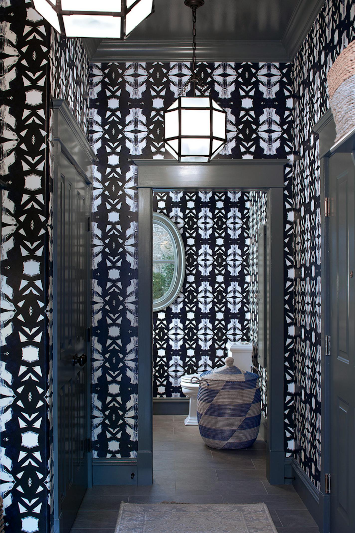
Farrow & Ball De Nimes
De Nimes by Farrow & Ball isn’t just a color; it can be an energy shift. “It’s actually a deep bluey-gray in person,” says Cross-Beard, who used it just off her clients’ bright white kitchen for intentional contrast. “I like the idea of bringing this moody moment to walk into as a divergence from the kitchen,” she says. Anything lighter would’ve felt like a missed note. “We needed a darker trim to ground that space. Otherwise the wallpaper just would’ve really felt overpowering.”


